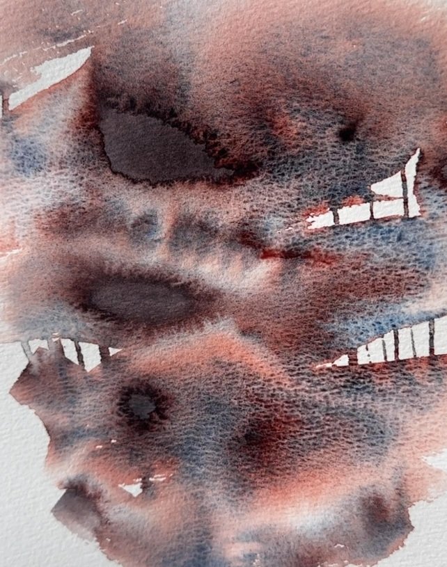
What are cascading watercolours?
One of the most fascinating things about watercolour is that the paint doesn’t always behave in the way we expect. Sometimes, as a wash spreads across the paper, a single colour begins to reveal several different shades. A violet might show hints of blue and pink, while a grey can develop unexpected violet or earthy tones.
This is the beauty of cascading watercolours.
Cascading colours contain more than one pigment. When the paint is diluted and allowed to move across wet paper, the individual pigments can behave differently. They may travel at different speeds or settle in different areas, creating visible colour separation.
Instead of a completely uniform wash, you get a more varied result, with subtle shifts in tone and interesting patterns appearing as the paint dries.
The effect can be delicate or quite dramatic, depending on the colour, the amount of water you use and the surface you paint on. It is a lovely technique for artists who enjoy working with the natural movement of watercolour rather than trying to control every mark.
Seven Renesans colours to explore
The new Renesans Intense Watercolour range includes colours confirmed to have cascading properties. Each has its own character, making them interesting to explore both individually and in a painting.
76. Alpenglow
A delicate, muted blue with lavender undertones. Alpenglow is a beautiful option for painting soft skies, distant mountains and cool shadows. Try letting it spread freely across wet paper to see how its colour develops.
77. Mystical Violet
A soft, dreamy violet with hints of pink and lilac. This shade is ideal for floral subjects, evening skies and expressive abstract work. Its gentle character makes it a good choice when you want colour variation without an overly strong contrast.
82. Masurian Grey
A deep, smoky grey with muted violet undertones. Rather than behaving like a flat neutral grey, Masurian Grey can introduce subtle colour shifts that are useful for stormy skies, rocks, shadows and atmospheric landscapes.
83. Moon Grey
A warm, earthy grey with subtle brown and dusty rose undertones. Moon Grey is an interesting colour for natural subjects, stone textures, old buildings and landscape details. Its warmer character makes it a useful alternative to cooler greys.
84. Lunar Blue
A muted blue with soft grey undertones. Lunar Blue is well suited to skies, water, distant mountains and cool shadows. Its cascading behaviour can bring extra depth and variation to areas that might otherwise look quite uniform.
These seven colours offer a wide range of possibilities, from delicate pinks and violets to atmospheric greys and blues. You can use them on their own or combine them with other colours in your palette.
Explore the Renesans Intense Watercolour range in the shop.
How to paint with cascading watercolours
You don’t need a complicated technique to get started. In fact, the best way to discover what a cascading colour can do is to give it enough water and space to move.
Here is a simple exercise to try.
You will need:
- Watercolour paper
- One or more cascading watercolour shades
- A clean water container
- A watercolour brush
- A mixing palette
- A piece of kitchen towel
Step 1: Prepare your paper
Start with a clean sheet of watercolour paper. A cold-pressed surface is a good option because its texture can add another dimension to the finished wash.
If you are using a larger sheet, secure it to a board so it stays in place while you work.
Step 2: Wet the surface
Use a clean brush to apply a generous, even layer of clean water to a small area of the paper.
The surface should be damp and glossy, but not covered in large puddles. If there is too much water, the paint may spread uncontrollably. If the paper is too dry, there may not be enough movement for the pigments to separate.
Step 3: Load your brush with paint
Mix a good amount of your chosen cascading colour with water. Start with a reasonably concentrated mixture so you can see how the colour behaves.
Try not to make the paint too weak at this stage. You can always add more water later.
Step 4: Apply the paint
Touch your loaded brush to the damp paper and let the paint spread naturally.
Watch how the colour moves. You may notice different shades becoming visible as the pigments travel and settle. Resist the temptation to keep brushing over the area. The less you interfere, the more naturally the effect can develop.
Step 5: Experiment with water and pigment
Try adding a little more clean water to one part of the wash. In another area, add a stronger concentration of paint.
Notice how the results differ. More water can encourage the paint to spread, while a stronger mixture can create areas of deeper colour. There is no single correct result, so it is worth repeating the experiment with different amounts.
Step 6: Let it dry
Leave the wash to dry naturally. Avoid overworking it or repeatedly moving the paint around with your brush.
The final effect often becomes more visible as the water evaporates and the pigments settle on the paper.
One colour, three different results
A particularly useful exercise is to test the same cascading colour in three ways. This helps you understand how much the amount of water and the condition of the paper can influence the finished result.
1. Concentrated wash
Mix the paint with a smaller amount of water and apply it to dry paper or in a controlled wash. This gives you a stronger, deeper impression of the colour. You may see some variation, but the overall wash will generally look more concentrated.
2. Diluted wash
Add more water to the paint and apply a lighter mixture. The colour will appear softer, and subtle undertones may become easier to notice. Compare it with the concentrated version and see how the character of the shade changes.
3. Wet-on-wet application
Dampen the paper first, then apply the paint. This gives the pigments room to move and is often the most interesting way to explore cascading behaviour. Watch for colour separation, soft edges and unexpected patterns as the wash develops.
Try painting all three versions next to each other on the same sheet. Label each sample so you can compare the results once they are completely dry.
What influences colour separation?
Cascading watercolours are wonderfully responsive, but the result is not always identical. Several factors can influence how the pigments behave.
- Amount of water: More water usually allows the paint to travel further, while less water gives you more control over where it goes.
- Paper texture: The surface of the paper affects how water and pigment move. A textured paper may produce a different result from a smoother one.
- Pigment concentration: A strong mixture gives a deeper colour, while a more diluted mixture can reveal softer variations.
- Drying conditions: Temperature, airflow and the speed at which the paper dries can all affect the final appearance.
- Brushwork: Too much brushing can disturb the natural movement of the pigments and reduce the visible separation.
For this reason, it is worth keeping a small collection of colour tests. Make a note of the paper, water and paint mixture you used. Over time, you will build a useful reference for your own painting practice.
Cascading and granulating: are they the same?
The terms are sometimes used together, but they describe different effects.
Granulation is the visible texture created when pigment particles settle unevenly into the texture of the paper. It can give a wash a speckled, grainy or textured appearance.
Cascading describes the separation of different pigments within a colour. As the paint moves across wet paper, the pigments can become more visibly distinct, revealing different shades.
A watercolour can be granulating, cascading, both or neither. Some of the new Renesans shades offer both effects, while Wisteria (73) is confirmed as cascading but is not listed as granulating.
This distinction is useful when choosing colours for a particular effect. If you want visible texture, look for granulating colours. If you want different pigments to reveal themselves within a wash, try cascading colours.
Where can you use cascading watercolours?
Once you have experimented with a few colour tests, try using the effect in a finished painting.
- Skies: Use Alpenglow or Lunar Blue for soft, atmospheric skies with subtle colour changes.
- Flowers: Wisteria, Lavender and Mystical Violet can add variation to petals and floral backgrounds.
- Mountains and rocks: Masurian Grey and Lunar Blue are useful for creating depth and cooler shadows.
- Natural textures: Moon Grey can bring warmth and variation to stones, tree bark and earthy details.
- Abstract washes: Allow several cascading colours to meet on damp paper and see how their individual tones interact.
You don’t have to use the effect everywhere. Sometimes a small area of pigment separation is enough to make a painting more interesting.
Give the pigments room to work
Cascading watercolours are a reminder of what makes this medium so enjoyable: water and pigment can create effects that are difficult to reproduce with any other painting technique.
The seven new Renesans Intense Watercolour shades offer plenty of opportunities to experiment with colour separation, whether you prefer delicate washes or stronger, more expressive effects.
Start with a few small tests, change the amount of water, try different papers and see what happens. You may discover a combination or texture that becomes a favourite part of your painting process.
Ready to experiment? Explore the Renesans watercolour paints available in the shop and choose a cascading shade to try.
Happy painting!